Scatterplots
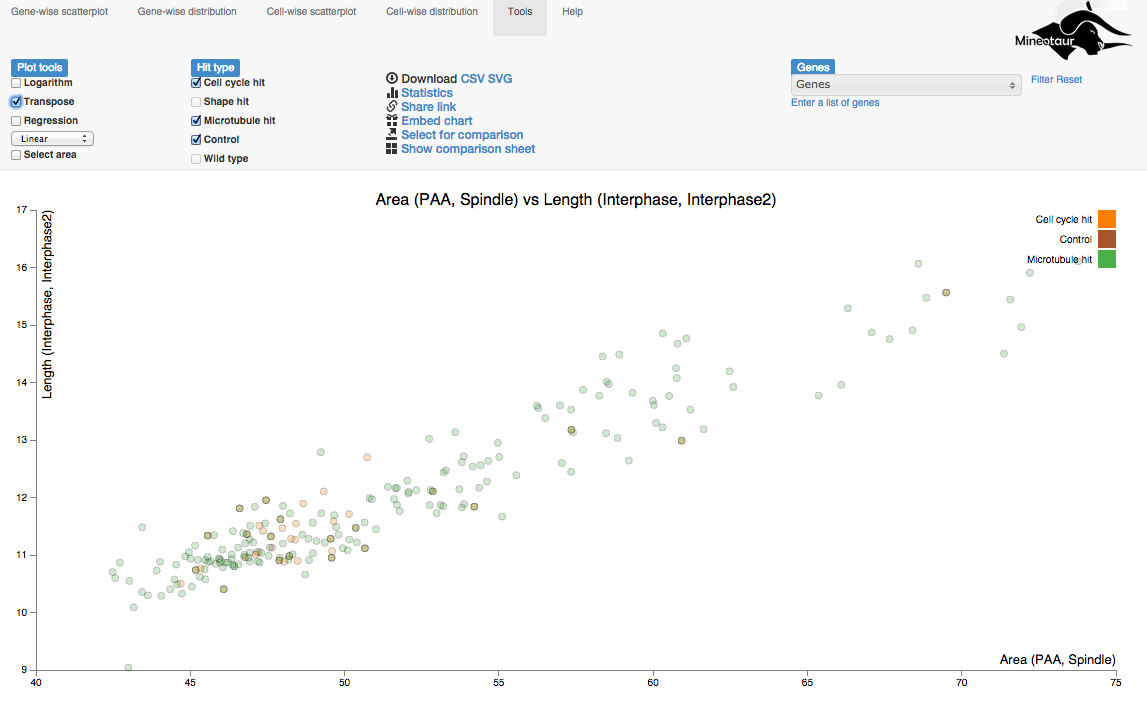
A scatter plot shows two variables against each other in a 2D coordinate system. In a Mineotaur instance, there are two kinds of scatterplots: group level and descriptive level scatterplots. The query plot for a group level scatterplot looks like this:
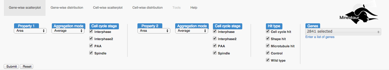
Using the scatterplot
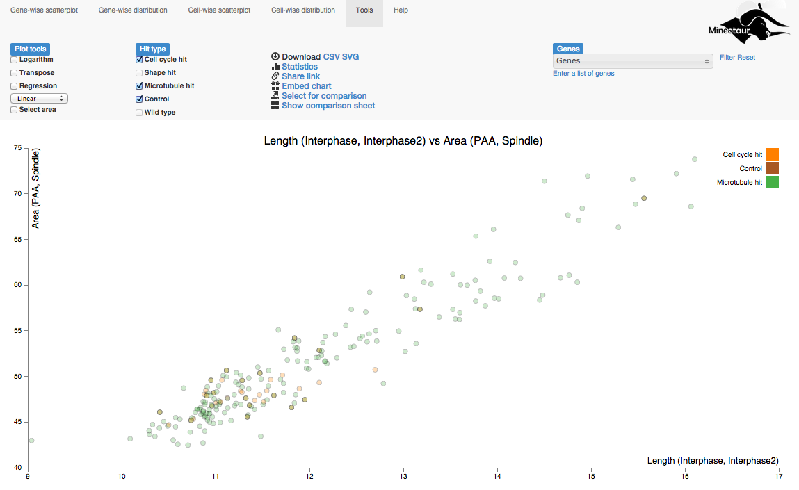
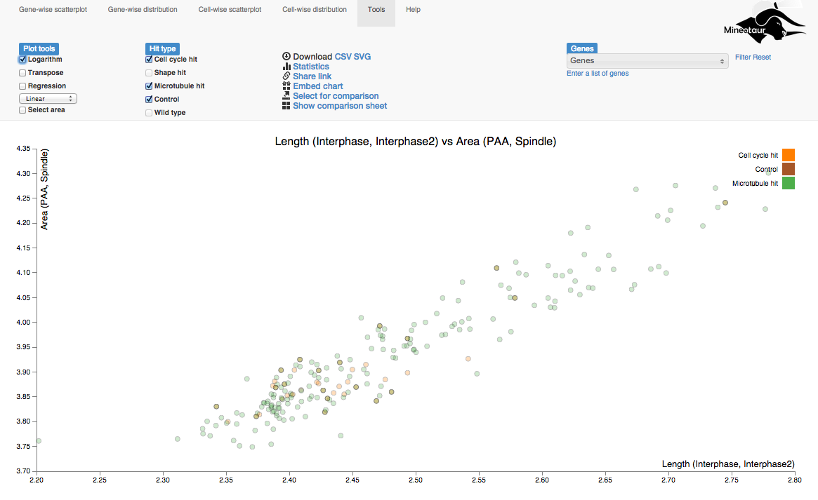
Once you hit the submit button, the query is sent to the server and if there was data returned, a plot like this is displayed:
Coloring
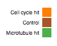
The coloring of the data point are based on the colors associated to each annotation (hit) type, which can be seen in the top right corner of the plot:
The nodes are also transparent, which enables the visual representation of multiple annotations (for which the coloring is the addition of the colors) as well as showing distribution of the data points.
Exploring invidiual data points
Name and values
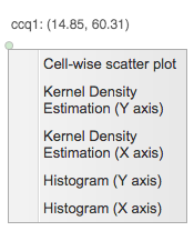
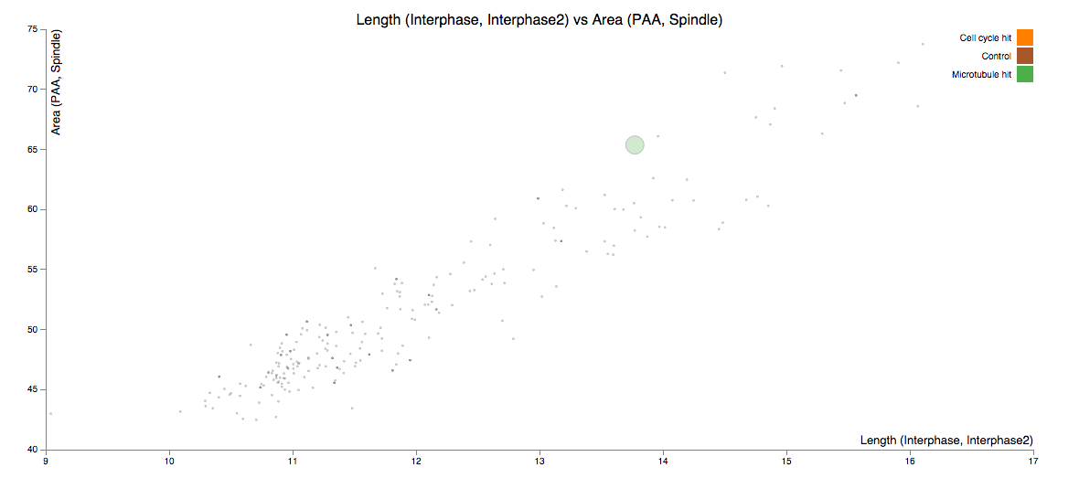
To see the name of the underlying data point and the respective values for the queried variables, hover the mouse over the data point.
External resource
(Optional) Left clicking on the data points will open an external link associated to the object, e.g. the raw images used for analysis. This option only works if the external resource is provided during the instance generation.
Subqueries
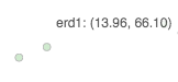
By invoking the context menu (e.g. right-click in Windows or CMD+click in OSX) a subquery for the selected node can be created. That is, we can see the distribution of one of the queried variables or a descriptive scatterplot.
To go back to the original scatterplot, use the browser’s back button.
Plot tools
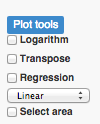
Plot tools contain several to transform or analyze plots
Logarithm
Clicking on the Logarithm checkbox transform the axes of the plot to logarithmic scale.
To go back to the original scale, untick the checkbox.
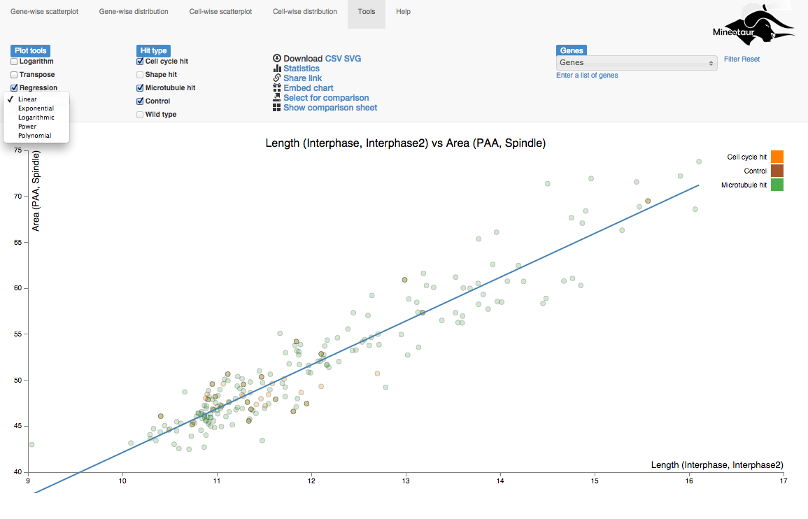
Transpose
Clicking on the Logarithm checkbox swaps the X-axis and the Y-axis.
To go back to the original scale, untick the checkbox.
Regression
Clicking on the Regression checkbox fits a regression line on the data shown in the current plot. The type of the regression line can be selected from the selection box next to the checkbox.
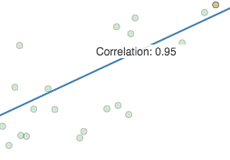
To see the correlation coefficient of the regression line, hover the mouse over the line:
To remove the regression line, untick the checkbox.
Select area
To analyze a specific area of the plot, use the Select area tool. Checking the box transforms the cursor to an area selection tool, what you can use to draw a rectangle around the area to be selected:
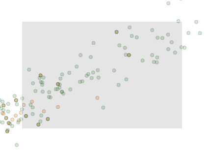
If you are satisfied with the selection, hover over the are and click on the Analyze button:
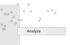
Then, a plot showing the data points from the selected are is shown. To go back to the previous plot, use the browsers Back button.
Visual filtering of nodes
Since scatterplots can be overcrowded, it is might be hardd to find individual objects on a plot. For example, genes of interest can be highlighted on a plot by selecting them from the provided list and clicking on the Filter link.
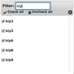
The highlighting can be reset by using the Reset link.
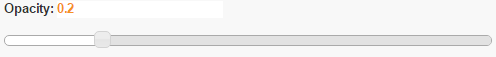
Setting the opacity
To enable the visual inspection of crowded areas, once could use the opacity slider to set the right amount of transparency.